Unit 69 : Assignment 1 - Drawing Concept Art for Computer Games
The procedure of concept art, involves one starting with the core idea to something within the game that is being worked on. It can be anything, ranging from any scale. It acts as the nexus for the design aspect of characters, levels, items, environments/settings. Once a sketch has been drawn out, it can be manipulated and altered to gradually build a final version that is the most suitable for the game. The artist is given free will to try and express what they want to bring to the mood with the designs, and experimenting with vary stages of the design. For example, drawing a piece of armour, and gradually showing the decaying process it goes through as you go through the game and become more "battle-torn".
 |
| Gaius - The 3rd Colossi (Concept) |
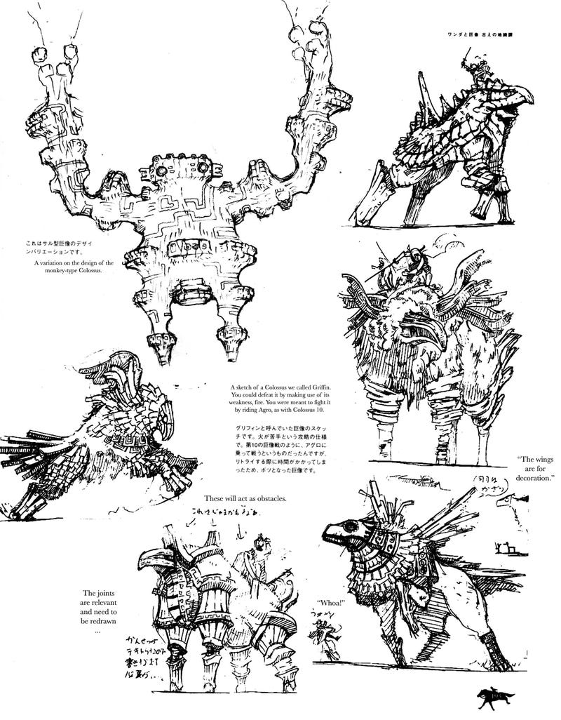
To the left is an example of concept art from the game, Shadow of the Colossus, where there are a total of 16 main enemies, which are all bosses. Each brings it's own unique design and attributes. As you can see, the sketch eventually transferred into the real game, and became a walking titan.
 |
| Scrapped Colossi Concepts |
The second piece of concept art is from the same game, but all these ideas were scrapped in favour of the current content we got. Each piece though shares the same amount of care and diversity that every design got, which can make the field of concept to be quite disheartening at times, to see a project you spent so many hours on not make it into the final game. It's also a factor that can spur some backlash from the fanbase, as there are many cases of cut content/scrapped ideas causing fans to question the thought process and claim the game would've been much better if it was included. Typically, an artist will start with a rough sketch, then either roughly colour the sketch to check that they work well, and begin to add a more tuned line work and paint job/shading to improve that final version. However, you can just finish with the initial sketch.
Progression towards the design piece is a fascinating process, as the design can drastically alter from the original "beta" sketch. Here we can see just how far the character Ragna the Bloodedge (BlazBlue), went from skin-tight clothing, brown hair, and a medium sized sword, to having exaggerated, yet distinctive white hair, buster sword and a red coat. This leaves a more lasting impression of the character, and colour theory must also be taken into account, as you'll want to make colour combinations compliment one another. You don't want a character with colours that don't go together and appear "ugly" and unattractive just based off their clothing. Red is typically considered to be a protagonist colour, especially within the fighting game realm, so someone familiar with the series will most likely see this character as that without even knowing who they are, and the more exotic design displays a sense of relevance as well, I mean, who would need a sword that big? The main character, that's who.
 |
| Ragna the Bloodedge Concept Art progression |
Here is Haku-men from the same game as previously shown, BlazBlue. We get a really great close up of his armour, and how it moves with him, as the size and unique style may cause some curiosity. The upper torso is broken down into sections that demonstrate how his swords sheathe is attached to his back, how the neck piece breaks into sections as he looks upwards, shoulder leveling, and wast twisting. It's also common to find a front and profile shot, to get a better look at the proportions of the head/body type. The style of his armour brings a familiar flare to that of a samurai, due to the pony tail and Japanese Hakama styled legwear, but with the games own unique flavours sprinkled in to make the character fit into the universe. Breaking down the characters this ways allows you to appreciate more aspects of the design you may not have noticed before, such as the red eyes planted around his armour, or just how the pieces flex and bump against one another.
 |
| Haku-men Concept Art (BlazBlue) |
Another style is that of illustrations, as well as key-frames. This is commonly used as a way to sketch out important shots from a scene or to further demonstrate a characters abilities, and to give a "skeleton" to it, so for example, you would have a character attacking as a key frame, and then the standby phase of the conflict, then draw in what goes in between to make that scene be complete. Although often times, illustrations are primarily used as "stills" to show the story with powerful art and allowing the sound design to immerse the player within the scene. Think of it like a graphic novel, but with an audiobook backing it.
 |
| Captain Hazama Concept Art (BlazBlue) |
Key-framing works very similarly, but is more focused on breaking down animation steps, like the mouth movement, body alterations and so on. Each step is a key in the timeline, and once more frames are filled in to join all the key-frames together, you end up with a fluent animation to come to fruition. This can apply to 3D model animations, and 2D drawn animations.
Below is a piece of environment concept art is from Dark Souls: Prepare to Die Edition, as shown in a gorgeous panoramic shot. It evokes the feeling of an isolated ruin, long past its time, slowly but already engulfed in plantation, but the openness of the arena brings a gladiator feel to it, where two must battle to the death in a heart-stopping intense duel. The boss itself is on display, but cast in dark, incomprehensible shadow, hunched over as if it's being drained from the weight of darkness, as a ray of light casts down upon him. Which could lead to interpretation that the Knight must seek enlightenment or just light itself to free himself from the dark that shackles him, whilst barely being able to lift his sword. This is all given for the viewer to dissect and interpret their own meaning behind the artwork, and take a look at what the artist wanted to show through their vision of this level/world. As well as this, the style, mood, character, and symbolism all coincide with the theme of Dark Souls, not feeling out of place or easily mistakable for another game. This game is dark, brooding, lifeless, but also, displays a shimmer of hope, as seen from the light being cast down on this ruined battleground.
| Dark Souls Prepare to Die |
Concept art can come in many forms, and is widely sought out by fans that want to examine and take apart each design to full appreciate the effort that goes into the design aspect of games. Artbooks are extremely popular with granting this desire, and are sold are high prices or often included with special edition purchases of the game. It can act as a way to inspire and drive artists to seek out a career within the games industry so that they too can add their own creative mind to a project to bring something imaginative to the game.
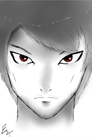
I've also drawn up my own concepts for my game, that are still in early development. The way I do this is with a program known as PaintTool SAI, with a Wacom Grahpics tablet. I sketch out a rough concept, then gradually go inter further depth with the shading and lineawork. So far I've drawn a brief beta design for the Main Character and some variations of clown enemies.
I've also drawn up my own concepts for my game, that are still in early development. The way I do this is with a program known as PaintTool SAI, with a Wacom Grahpics tablet. I sketch out a rough concept, then gradually go inter further depth with the shading and lineawork. So far I've drawn a brief beta design for the Main Character and some variations of clown enemies.

