Friday 23 June 2017

Unit 4 & 5 - Game Evaluation

Unit 4 & 5 - Game Evaluation 


Initial Concept

For my concept, I immediately drew inspiration from DOOM (2016), as at the time it was a game I was very fond of and interested in with its focus on fast paced combat, and robust level design. The story was set in Spain, and the player controls a person known as "Vega". The gimmick would be that they would be wearing a tinted motorcycle helmet and with no skin on show. This was done to give the player a better time projecting themselves onto the character, allowing them to become more invested into the protagonist. The player would start out in a small town already affected by the mysterious clown invasion, and must quickly search the area for information leading to the path forward, as well as power ups and other little collectibles. There would be little explanation as to why the character is so experienced from the get go, as I wanted to key focus to be the game play, and give little expansions on plot through progression and notes found throughout the levels.

Admittedly this was a bit of an ambiguous task going in, as I was creating the game by myself, but I wanted to challenge myself and see how well I could do. Overall, I think I met it about half way. Time constraints and various bugs and problems led to a good amount of content being scrapped. A HUGE constraint I had while making my game, was the fact that no matter what I could not ever import models and meshes I created in Maya into Unreal. Meaning all of the assets used were from Unreal. Several key models had to be shelved because of this, such as the weapons, enemies, objects. Basically everything. This not only stopped me from adding my own assets, but it halted a lot of the time I could've spent working on the game, which led to more delays due to the lack of time. Despite this, I kept going and made appropriate adjustments where they were needed. For example, instead of having my own model to differentiate the player model from the enemies, I would simply throw on a vibrant, glowing texture so they at least stood out in the levels and would grab the players' attention.


Levels/Stages

  • Stage 1

Features - Forest, Hills, Single Building

The beginning level is relatively the same, as it takes place on Earth, features a building surrounded by wilderness, however the overall size had to be cut down due to time. As a way to get away with adding odd and ways to manipulate the environments in my game, the story enables the clown world to infect and break apart reality of the real world, so that is why there are buildings that are merged with rocks and impossible physics, as the clown portals are shifting what is physically possible as it becomes more unstable. Originally the level was meant to be more open, with around 3-4 buildings the player could enter and explore, this was unfortunately cut down to one, with a portal leading to next level. I wanted the focus to be more focused on how the invasion is destroying the world, with the player starting in an ominous woodland area, and the sounds of distant shooting, sirens, and people screaming can be heard. I felt as though this would add a bit more immersion to the world and make the level feel more like an actual "world" being attacked, not just the player being affected by what's in front of them. The player will walk forward through a degrading forest till they come across the main building of the level, in there they will find corpses of those unfortunately caught by the Clown Portal, and as well as that two Clown enemies stalking the halls. When the player makes their way upstairs, they shall find the portal for the next stage and enter it to progress.

  • Stage 2

Features - Cave, Degrading Building, Abyss

Once the player enters the portal, they are thrown into a hellish cave leading two ways. If they venture behind their spawn, they will be greeted to an endless abyss, with a spiraling, demonic sky box that has gotten out of control. I included sounds of a subtle yet noticeable thunderstorm for ambient sounds, to help sell the out of control sky box surrounding the level. Clearly this shouldn't be the way to go so the player heads the other way, towards orange lights placed to help guide them. However I also chose more hot colours like orange and red to represent danger incoming, as they'll soon find themselves not alone. As they make there way up the stairs, it becomes apparent that the nonsensical cave has merged with a building of some sorts, which is being corrupted by the clown's presence. This level was designed to be more combat focused with the player facing roughly 8 clowns, and giving more freedom to moving around the environment. Moving past the way up the stairway and through a darkened room, the player should find the second portal, leading to the final stage. With a lasting shot of the vast sky box.

  • Stage 3

Features - Meteor, Planet,  F.T.L. Space travel Skybox

At last the final stage arrives. For the sake of punctuating the feeling of a rush and feeling of a "Final Stage" with high stakes, I placed in some more noticeable music (Tekken 7 - Mishima Building). I felt this was a fitting choice due to the unnatural tempo the song has, and as well as that it luckily matches the speed of the sky box. The story behind this stage is that a meteor that has dragged pieces of the earth from it (Trees etc) is caught in a Faster Than Light corridor as the Clowns attempt to drag Earth into their dimension. The objective originally was to eliminate the boss of the stage, "Nozu". As previously mentioned though, I couldn't get any assets I created into Unreal, so unfortunately the fight had to be cut. Instead I just placed a final portal at the end of the stage, and filled the level with various mob enemies to try and slow down the player as they make a "trench run" to the end goal. Once they reach the end, they win. If Nozu was included, it would've have ended when the boss' health reached zero. The level itself consists of an open, narrow meteor. The sky box is an incredibly fast corridor, simulating incredible speed, with a model of the Earth placed in the center of the sun light direction. Showing the player the what's at stakes.


Differences to Original brief & Challenges faced

A lot changed from my initial concept, but I'm not too upset about some of the content that I scrapped. Originally I had a bit more focus on plot and characters, but now I prefer my more ambiguous main character and no real reasoning why or how the Clowns are attacking. Not knowing can be more scary or intriguing than having everything explained. Sadly a lot of enemies never made it, only able to include one enemy type due to time constraints, but mostly because of Maya being unable to import models into Unreal, and therefor having no enemy models to work into being AI. Smaller changes were made to the main protagonist too, before I initially sketched out his face and how he would look, but now opted to obscure his entire body to make creating his model a more easier task so I wouldn't have to model a face accurately, but to let the player project themselves more like I mentioned previously. At its core the changes to my game were made entirely from facing technical issues, so I would just move on and try to find another way to work past it to progress. Weapons, Environments, Enemies, any model I intended to create and follow up on had to be scrapped from the main game because of the technical issues with Maya/Unreal. Drastically hindering the original content and progress of the game, and sadly what it could have been. The amount of levels though are around the amount I wanted, 3 to 4, so it's a decent length for a prototype.

Probably the biggest issue I face was when it came to killing enemy AI, as well as my projectiles. For some reason I encountered a strange bug where the standard gun for Unreal would fire normally but no mesh of the projectile could be seen anywhere, despite still causing physical collisions in the world to take place, like knocking over boxes etc. This in turn disrupted collisions with the AI that was then supposed to destroy them. With little luck understanding what exactly was wrong I nearly scrapped combat all together to instead focus on a more "Survival Horror" approach, but with major help from a fellow classmate, we determined that there were faults with the original blueprints of the gun, as well as collision errors for the projectile. After a long session of testing we finally solved it, and now not only can I fire my gun again, I can also destroy AI enemies as well as make them ragdoll as they are destroyed.

Secondly, transitioning between my three levels turned out to be slightly trickier. Getting from the first level to the second was easy, I simply added a portal box that when touched by the player controlled character it would take them to "SecondStage" in the blueprints. The problem was I couldn't copy it and just place it again for the second level because the blueprints specify that it will send the player to whatever stage is listed. So obviously it would keep looping over, and over. This had me halted for a while, but after soon realising the easy fix I was able to squash this minor bug. All I did was create a secondary portal box, and within the collision blueprints for it I'd tell it to send the player to "FinalStage". So each level had its own specific portal to send the player to their correct destination.

A personal touch I wanted to incorporate into my game was the design of the clowns, and while it can't really been seen cause of the lack of models, I felt more happier working with the given Clown concept Wayne had given to us when I focused on making them more demonic than humanoid, which helped me come up with more creative designs that were fun to brainstorm. Unlike the humanoid clowns from the movie that spawned the brief to begin with.


Conclusion

Overall now I can I'm still very happy with what I managed to accomplish, and proud that I could find ways to solve problems that initially caused me so much delay with progression. I feel as though the core mechanics and design is fairly solid, and the sound design added a lot to it too. Creating the levels and trying to craft an interesting scene for the player to explore was a great experience and I enjoyed the entire creation process altogether, despite all the bugs and complications. Really my only issue or disappointment with my game was all of the lost potential I could have had with the models I had designed that couldn't get imported into the game. I would've liked to have tried to assign AI to my more unique enemy designs that don't follow a basic human rig structure, and just in general it would have been nice to see that side of my work make it into a the world I had created for it. A lot feels lost without my assets, but I still did what I could to salvage it and I feel like it's an acceptable prototype.
Tuesday 20 June 2017

Unit 66 - 3D Modelling

Unit 66 - Creating a 3D Model

Instead of using an image to lay onto the image plane as a reference, I used my own initial design, as my model was not being based off a human skeletal structure. So I used more basis shapes, with more polygons to appear more rounded and less sharp.

The methods I used were combining many varying shapes, such as spheres and and cones, and manipulating the vertexes and edges to make more complex shapes or just if I ever needed to manipulate them. As well as this, using the move tool to adjust any placements of my shapes, this made it simple to easily move around objects to place where they're needed to help build the model,. Adjustments would be made using the rotation tool if something needed to be turned a certain way, and for increasing size or morphing a more unique shaped from a cube or anything else.
Starting Model / Partial Detail (Front)

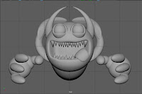
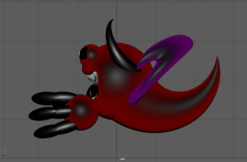
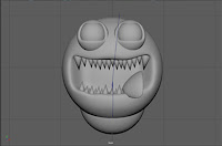
I began with a basic sphere for the entire body, which also happens to be the face. The character itself is an enemy, called "Nozu" which is basically a giant nose that is a sub-boss in the game. The core design was to be based on using spheres for the main body, eye sockets and eyeballs. After I had assigned all of the main face features, I began to manipulate and shift the core sphere by selecting the faces, and pulling them back so they cave inwards, creating the mouth for my model.

Starting Model / Partial Detail (Side)
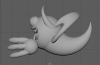
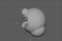
Once the mouth had been molded, I then smoothed the mesh so the edges around the mouth looked more appealing with more polygons, making the model seem more fluent and natural. After that was done, I started to add small details to give more flare to the model, creating cone shapes, shrinking them down and fitting them in the mouth to give the look of teeth. Afterwards I followed up by flattening a sphere and stretching it, then applying a bend function to it so it could act as the tongue and placed it in the mouth too.

After I had gotten the key features down, it was time to work on the limbs and more striking features to make the model stand out more and not just be a simple shape all around. I created more spheres for the hands, and stretched others to form fingers and joined them together using a joint function, and parenting them altogether so they moved as one without having any clipping issues. What I did after was create a couple more cone shapes, stretched and bent them, and then stuck to the outer edge of the body. These would be used as the horns, and another larger cone was placed on the backside to give more of a ghoulish look, or even a tail.

Untextured Model (Front)


Untextured Model (Side)


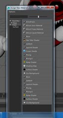
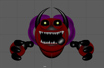
With my model at an acceptable stage in development, I decided to start adding textures. Even if they were simple, I wanted to get a better look at how it would appear with the right colours attached. To do this I right clicked on the section of the model I wanted to apply the texture to, and clicked on "Add New Material...". This then opens up another list of options, displaying a varied number of texture options with their own unique looks and effects to them. The one I wanted was Ramp Shader. This particular texture allowed me to use more vibrant colours.


Final Model - Textured - Front


Final Model - Textured - Side


Monday 19 June 2017

Audience response to Media Products - Unit 6 - Task 1 - P3

Unit 6 - P3 - Task 1

Understand how media audiences respond to media products


Results from the Survey

I was tasked with conducting research by gathering results from a survey, this led to the following results...

I found out that most people that answered turned out to be of the age of 17 and above, and Male. A very common demographic among gamers nowadays. The total amount of time played came to around 20+ hours a week, and the genre of games featured were focused more on adventuring but also featured violence set for a more mature audience. Despite this though, many of the responses from the survey showed that they didn't consider themselves to be more violent from video games, and that they don't take the age ratings into account. Further evidence of this is that most people answered that their first interaction with a mature 18 rated game was averaged at the age of 10-15 years old. The early exposure however hasn't led to any increase of violence or change of opinion from them, but most people answered that they are more desensitized to violence because of violent video games, and haven't be distressed by the violence because of it.

Judging by these results, it shows that most people have been introduced to violence in video games at a young age, around 10 years old with little consideration for the actual mature ratings, and this has led to them becoming more and more desensitized to violence which could lead to further interest in more mature games as they have no worry of being disturbed by mature imagery. The longer someone plays violent video games, the less they are bothered by violence in the real world.


Audience Theory


  • Hypodermic Needle Model
The concept of the Hypodermic Needle Model, is the effect of a source of media causing a direct impact on a person, and causing them to replicate actions seen in a video game, movie or any other form of media, and carrying them out in real life. Many point to video games causing troubled youths to commit crimes and even murder due to implications of a violent video game, but this is simply not true, or at least all there is to it. For starters the number of instances of this effect happening is far lower than many would lead you to believe, and also the reason for such instances to happen, like the infamous Manhunt game caused were also caused by mental illness. Coming to the conclusion this is a reason to believe video games are the cause of murders and crimes isn't plausible to the fact that there a hundreds and thousands of other gamers who have not followed in the same footsteps, and lead perfectly normal and peaceful lives.

The survey results I received also back this up as most of the responses openly say that they are desensitized to violence, but do not consider themselves violent, despite being exposed to violent games at a young age.

  • Uses and Gratification
This theory is used as a way to grasp the understanding of why someone is interested in a form of media and what keeps them invested. For example, the most common reason for someone being into video games is the gratification of escaping reality, a way to be who they want to be in a fantasy and self empowerment to a story far greater than the everyday life. Others seek challenge, and prefer games that don't hold your hand, or have a steep learning curve, but also rewards those who seek the challenge which is what invigorates them to try harder to reach the end. There is no logical comparison for someone to commit a crime to gain this gratification that you find in a game. Killing someone in real life has such a far greater impact and consequence to killing a polygonal NPC (Non-Playable Character), there is no reason to seek challenge or an escape you'd find from a game. It's not something you can escape from because the law will catch up to you, and your life will be permanently affected by your decision, because it's the real world.

  • Passive and Active Consumption
The differences of Passive and Active consumption is the act of how the consumer handles the media presented to them. What is meant by this is that Passive consumption deals with the audience viewing what is in front of them and not question anything at all, and excepting it. Active entices one to ask questions and let more unique thoughts flourish, and not expecting them to accept what you think. This could potentially lead to negative real world actions if the person blindly accepts violent implications and has no sense of morale, but again this is very rare and mostly a hypothetical situation.


Effects Debate

  • Effects or Exposure of explicit sexual or violent 
Violent and Sexual games have been around for a long time, and with the age ratings they are harder to be picked up by younger audiences, and will also be verified by staff if the person is of the appropriate age to purchase the game. As well as this, correct parental guidance can also prevent from mature games reaching a child's possession, however with the use of digital games and online downloads, practically anyone can gain access to mature game without the need for the physical copy.

  • Effects of Advertising
Advertising is problem the gaming industries biggest strength to use on the masses, as the form of media can be placed anywhere to advertise and is accepted pretty much everywhere, even to the point where games are featured on popular Television stations. Adverts are constantly being displayed on posters, banners, promotional goods, before movies, before Youtube videos. Basically, games are able to show themselves off to a mass market where anyone can look at and think "That appeals to me" and be hooked on what it has to offer. Something games tend to go for as well is the "Pre-Order" bonus, which is where a game will take an "exclusive" piece of content, typically an armour set, weapon or early access to the Beta, and will give it to any who Pre-Order to reach extra sales, as many people fall for wanting to apart of the "Exclusive club" and feel that "If I have that, I can show it off", usually the younger audience are most impressionable and go for this.

  • Health Concerns
The concerns with health have always been a topic and had many studies on the subject. Most would point again to the idea that they effect the mental health of the player to make them violent, when this is not true. Others would point to the effects on the eye, and while this does depend on exactly how much time is put into playing games and how close to the screen they are, videos have actually been proven to improve eye coordination and reflexes.

  • Censorship Debates
With the amount of controversy to do with violent games, of course there are those who feel that censorship should be an alternative. However a vast majority would argue against this, and feel as though they would be hindering the artistic integrity of the game/story. This is also applicable to Television shows and Movies, there is always a backlash against censors because many people feel as though it's needless and takes away a lot from a moment that needs that mature edge to it. It's not right to pander and treat gamers like children.


Responses

  • Negotiated
The response that warrants the player to negotiate is one that gives the player a world with ideals and opinions, but lets them add and think of their own too. Adding a piece of their experiences and interests into the game to further invest themselves.

  • Preferred
This is where the player understands and agrees with what the game presents them, and is able to gain their interest more because of the shared ideals. For example not glorifying violence which pretty much all of us can agree is the right thing to do, so we prefer that depiction over a game that treats violence like a positive solution.

  • Oppositional
Oppositional is just the opposite of "Preferred", where the player disagrees with what a game is displaying or trying to convey, like the previously mentioned positive outlook to violence or committing crimes of various nature, and presenting them in a positive light.

  • Participatory
Many gamers seek to find a story to become invested in, and video games offer what TV shows, Movies and books can't. The ability to participate in the story and affect the outcome of the story and characters within. It can keep people from thinking about their lives and often can lead to players caring more about the game world than the world they themselves are living in, which can naturally lead to negative effects on their health and social interactions. It's the major edge videos games have over all other media, the consumer can be part of the story.

  • Cultural Competence
Cultural Competence is how a video game handles making changes to accommodate cultural differences. A good example is how eastern games are released over to the western audiences, and how westerners need to wait upwards to an extra year for the the game to be properly translated appropriately and to its entirety. As well as this, changes to character names needs to be taken into account as they are pronounced and addressed differently over in countries like Japan.

  • Fan Culture
This side of responses typically handles the community that support the games they love, and modding communities always try to offer many different mods to keep games alive or simply add their own flare to spice up the original content. These can vary however, as depending on what game you're playing, the mods can be more "adult" oriented that isn't meant to be in hands of the younger audience. As well as that, players can make their own levels and games using existing engines. A negative example of this however would be that of the infamous Columbine High School shooting, where the two gunmen were later discovered to have created their own mod based off the game Doom, where they recreated the location of their school to plan out their attack, to then later carry out their rampage in real life. This isn't a completely legitimate reason against video games, or mods for that matter. As both of the youths were actively picked on and bullied throughout their years, and suffered from varying mental health problems.

My thoughts/Conclusion

In conclusion, I feel as though video games should not be held accountable for contributing to violence. From all of examples of people committing crimes and murders have all had symptoms pointing towards a mental health problem. As well as this there are countless factors to take into account here, bullying can lead to such events such as Columbine, where the gunmen had a hard time from bullies and being cast out from social interactions. It's not fair to group games into such terrible events simply because the guilty played a video game once. I'm not completely ruling out games as they do desensitize people to violence, but there's no evidence to them fully forcing someone to act out term. Modding and access to mature games as well can't be helped when their mostly accessed via the digital market, which is much easier to get by all the age restrictions. The key to me is good parenting and fair, but not excessive monitoring of what your child is playing and is into. Other than that, I feel that games offer a great escape to those seeking a good time away from reality, and allow those seeking a challenge to test themselves on a good way to kill time. Games are a form of entertainment. 

Wednesday 14 June 2017

Analysis of a Computer Game - BlazBlue


P4 – Analysis of a Computer Game

Image result for BlazBlue logo
BlazBlue (Series)

Presentation

Image result for BlazBlue Crest
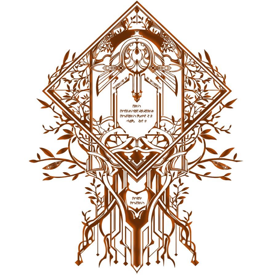
Each character has their own unique Crest
BlazBlue is a fighting game series developed by Arc System Works, which heavily focuses on a narrative presentation. So much so it is reflected in the menus and UI (User Interface) designs all around the game(s). With striking patterns for each characters respective Crest. Further complimenting the games rather unique attention to detail. As for most fighting games, story is barely touched on and glossed over, if you're lucky. With BlazBlue, while the story may be often overly complex and possibly convoluted, it at least attempts to tell a narrative not commonly found in it's genre, which is admirable.

The game is a 2-Dimensional Fighting game, where you can play from 12-36 characters, all fully constructed uses an advanced method of mimicking Sprites, by first creating a 3-D polygon model, then overlaying it with texturing and shading. Then, they appear on a 2-D plain, which also maintains the consistency of the games look with the characters, being more of an Anime style. With this style, and the use of sprites (Effects and particles), it is able to show off a more exaggerated way to show of moves and character movement.

Conceptional process of how the Sprites are constructed in a 2-D format


Narrative Structure (Introduction and Set up)

Story Select screen
The game handles it's story in two ways; One, is the traditional "Arcade" mode, a mode that's in pretty much every fighting game, where you battle your way through a ladder of enemies, typically 9. And upon completion, you get a short, non-canon ending for the character you chose. Usually this mode is just a way to get better with your character as it gives you time to not only play them more than you would from first glance, but lets you get to know them as you're learning their story and what their personality is like from it, building a better bond and understanding as to who they are. I feel as though it's rather clever way to allow players a better time adapting their play-styles and finding new characters to try out and maybe even love due to their personality alone, when in other games without story this wouldn't be apparent.


To call the story "complex" is probably being kind at best, as it tackles multiple time periods, and time travel. It honestly is very convoluted and at times frustrating to fully understand what is happening, but it's not hard to enjoy it from a basic level. The full grasp of the narrative is the difficult to comprehend, not the basics, and regardless, I find this leap in narrative for fighting games to be a great step for the genre, as again, so many games reply on uninteresting slideshows for their stories and character endings that seeing a fighting game actually trying to tell a compelling tale is more than admirable in my eyes. The story focuses in a stylised, futuristic city called Kagutsuchi, or as it's full name "13th Hierarchical City, Kagutsuchi".

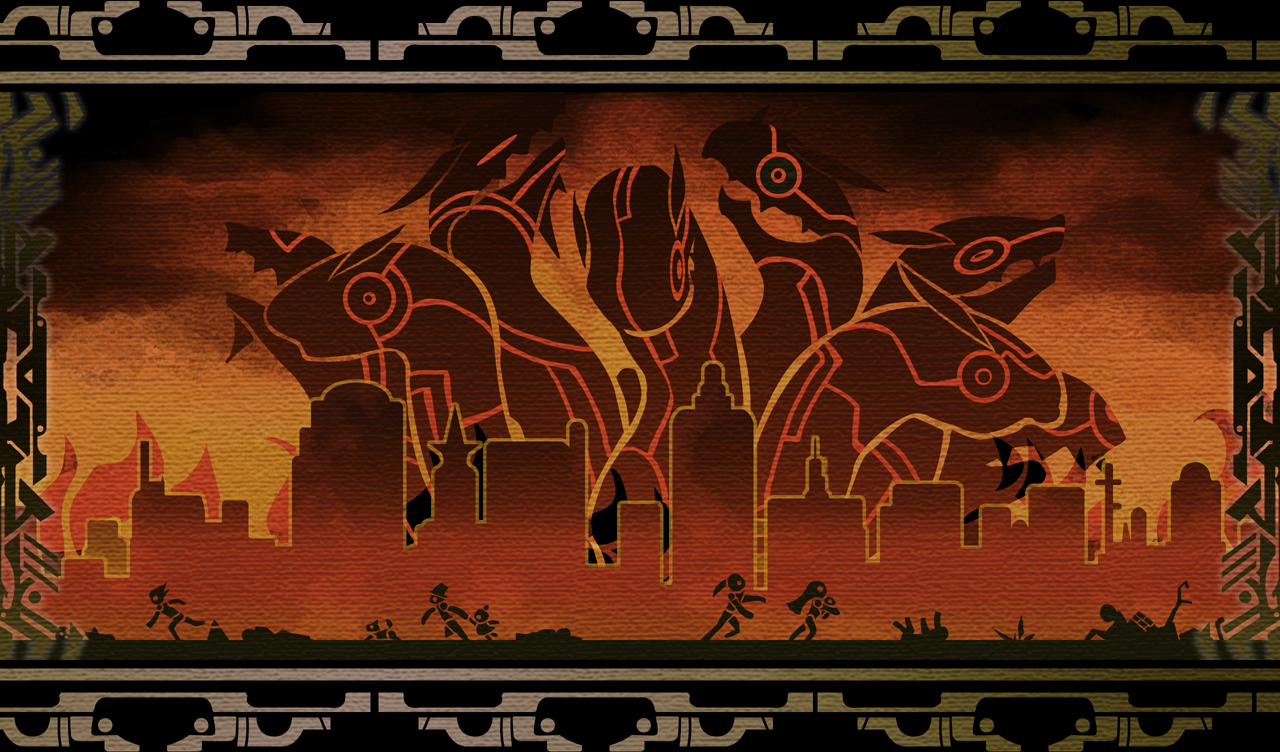
Mural depicting The Black Beast's attack

Mural depicting the Six Heroes
The beginning history is the tale of an ancient monster called "The Black Beast", a colossal serpentine creature, capable of mass destruction, and with zero recognition of friend or foe, attacks Japan, January 1st, 2100. Causing death and terror wherever it went, until it is eventually stopped by a group of warriors known as the "Six Heroes", whose victory and triumph is later told in legend along with the Black Beast.


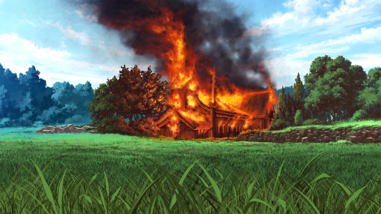
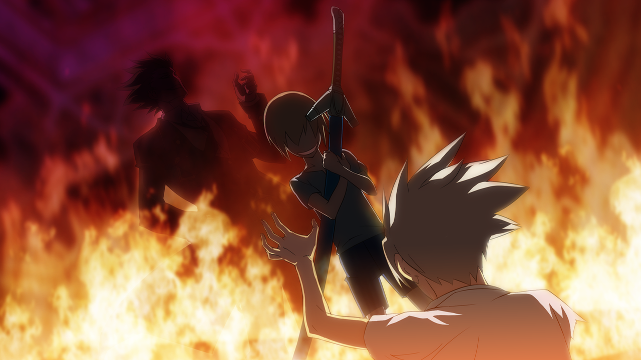
Image result for blazblue church fireIt begins with a brief flashback detailing our protagonist's childhood, and where they experienced a life changing moment.  Like Ryu from Street Fighter, the "protagonist" of the series, Ragna the Bloodedge, is the faithful front-man for the game as like all fighting games, giving players a relatively easy character to try out to get used to the mechanics, but not too easy for masters to show off, and to compliment this, their personality is likable due to his confidence, but also has moments of showing a sympathetic side with care to others. I feel as this is a good way to make Ragna a more likable hero, as he gives off somewhat of an anti-hero vibe, but not in a way that comes off as cold or selfish, and lets players feel more connected to him and the story.


As previously mentioned, the story begins with a flashback to Ragna's childhood, as a church where he, as well as his Brother and Sister attend, is burning down and as Ragna notices from a distance, proceeds to run towards it and try to stop it. Ragna, further showing a more caring and likeable side, tries his best to save not only his siblings, but the church itself, but ultimately failing as the fire has already consumed the Churches interior, leaving the trio trapped. Then, a mysterious and taunting voice appears, followed by the silhouette of series antagonist, Yuuki Terumi, who proceeds to taunt and torture Ragna, as his brother and sister look on. The reason they are not interfering, is due to Terumi revealing to Jin that Ragna has remnants of the Black Beast within him, and will bring back its murderous rampage through him. As they look on at Ragna struggling, Terumi proceeds to tear off his right arm, which plays into a gameplay mechanic later on for the character. The scene ends with Terumi leaving with both of Ragna's siblings, and with him still left in the burning church. He is later rescued by Jubei, one of the previously mentioned Six Heroes.
Ragna the Bloodedge
(Post incident)

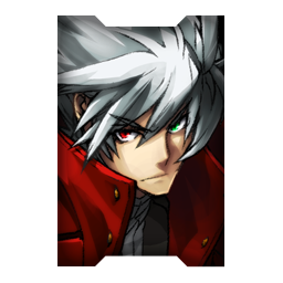
After being rescued, Ragna is nursed back to health and later trained by Jubei to grow into more of a warrior, and equips him with a new mechanical prosthetic arm, containing in it a Grimoire, allowing Ragna to use magical seals, which is a prominent power source within the BlazBlue universe. Before the experience at the church, Ragna's hair was of a light blonde shade, with green eyes, but after the incident and trauma from it, his hair turned to a frost white colour, as well as a side effect of gaining his Grimoire, turning one of his eyes red. After regaining the strength to prove himself to Jubei, he took him back to the Churches remains and gave him two items, a long Red Jacket and a Buster Sword that previously belonged to a hero, known as "Bloodedge". With his new name and weight of a man who wore the same gear as him, Ragna sets off on his own path.
Image result for Jubei
Jubei

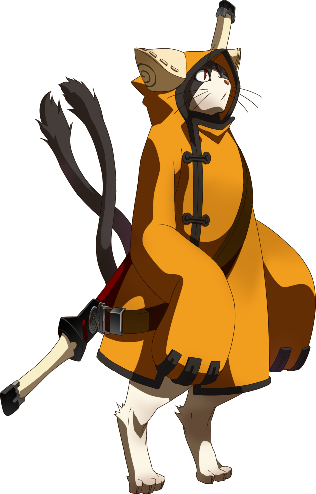
That is the summary of the beginning act to BlazBlue, and I believe it works well with setting up the kind of world that is being shown. Such as the use of magic, and races, since Jubei is a bipedal Cat, as it is later displayed there are cross Human and Animal people known as Beastkin, however their appearance can vary. With this there is a vast amount of possibilities in this world, due to the fantastical nature given to the player, and it does pay off. Each character has there own story, but what makes them different than just the typical "Fight 8 characters, boss, then get the ending" formula, BlazBlue's character stories contain varying routes and endings, as it lets players make decisions that impact the next fight and ending they'll receive. Even how the player acts throughout their fight can change the ending, for example, using the ultimate finishing finishing move known as an "Astral Finish", which basically completely destroys your opponent in a flashy sequence upon hit, if the player uses this too many times during Ragna's story, he'll be consumed by the power of his Grimoire and the Black Beast, eventually leading to a bad ending. This gives so much depth and diversity, as well as replay value to a single characters story, let alone 12-36 characters throughout the series. I personally feel this is a great step for the genre of fighting games, as it puts to shame not only the half-assed stories found in the majority of fighters, but Role-Playing games too, as they sometimes struggle to tell a compelling story with consequences and replay value. I only really touched on the intro to the story, due to the fact that if I were to go through every character story, we'd be here for all day, and not to mention the varying canon endings.


Representation of Characters

There are a fruitful amount of characters throughout BlazBlue that bring there own personalities and conflicts to the front, and all can be experienced through the games great attention to narrative, and each are represented wonderfully with complex and conflicting arcs, often spanning multiple games. Since the first game, the main character has been the hot-headed, Ragna the Bloodedge. Ragna offers a good protagonist to latch onto, as I went over in the Story section, Ragna's backstory can lead players to feel sympathy due to the brutal nature of what took place and being left for dead without a right arm. His personality once he gets back to functioning again, can be rude and harsh, which can come off as unlikable, but in the way it's written it's more so him letting his past still haunt him, as he did suffer a traumatic event in his early childhood, which is why when he gets moments of happiness or care from friendly characters, it's all the more heartwarming. And again, he doesn't come off as a douche like in other media, but simply that he's focused too much on finding the man that ruined his life to really care for others, which is later developed and grows to show more care for others. He does display a great persistence in his character, since he does come back from a near death experience, and throughout the story he gets even more beatings from story related battles, yet he continues to get back up and fight back, showing dedication which is great for a protagonist. Something I find interesting with BlazBlue is that all the characters feel just as important to the story, they all are given enough influence to the world and character to feel necessary for their placement, which show off their strengths and weaknesses not only in their specific stories, but also transfers to other characters' too.

Target Demographic / How the Audience is addressed?


BlazBlue is a game that is set to appeal to those with a love of fast, intense and satisfying action, as well as strategists who enjoy thoroughly learning the ins and outs of the game, and getting a mastery level where they can effortlessly play all playstyles given to them. As well as this the game appeals to fans from the Anime crowd, as it's stylised with exaggerated features which is prominent within the Anime style. I feel as though it can draw attention form various genres as well, such as hack and slash games like Devil May Cry, as in both games you're rewarded and encouraged to use vast amounts of flashy combos to achieve your goals, as well as being accompanied by fitting soundtracks that heighten the thrill of the fights you play.

The game is able to address the fans of former Fighting games, such as the Guilty Gear, since the people behind BlazBlue, Arc System Works, are now bringing an entirely new series to the table, which can gain the previous fandom to try it out. Also the manga and anime communities are typically attracted to the style of BlazBlue which grants more possible fans to gain interest, and the community can later flourish.


Chosen Genre ( Fighting Games )

Image result for TekkenImage result for Street Fighter

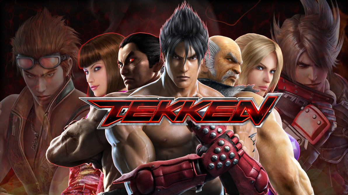
This game without a doubt falls under the fighting game Genre, and would be a staple in the Fighting Game Community (FGC), where tournaments are commonly held for each game to see who is the best at mastering the fundamentals of their chosen character. Games found within this genre are typically packed full of varied characters with a style of fighting to suit anyone, so someone can pick up and find someone of their fancy. Once you've found your character you can further your knowledge of their play-style by using the training/practice mod, a staple found in pretty much all fighting games. Usually each fighting game comes with its own unique flare and visual style, for example: Tekken for its more realistic character visuals, and real world fighting techniques, or Street Fighter with its exaggerated body proportions and cartoon cell shaded graphics. BlazBlue would fall under exaggerated and with more of an Anime style.

The genre was most popular back in the days of the arcades, with games such a Street Fighter, Tekken and Mortal Kombat dominating the scene, and allowing players to battle through a gauntlet of challengers to prove themselves as the best. Now though we have the power of online to fight anyone in the entire world, and the previously mentioned tournaments to go to if for those fancy themselves more for the competitive scene..


Unit 67 - Assignment 4 / Animation Sequence

Unit 67 - Assignment 4 / 3-D Modelling and Animation Sequence

Task 1

Initially the overall concept for my animation was to be the display of the after effects of the clown invasion, and a brief introduction to the main character. The way it was meant to be directed was similar that to an early teaser for a game, relying on a long build up to eventually show off the main character, and with the backdrop of the destroyed city where the game takes place nearby. The purpose of this was to give a sense of tone and show how the clown invasion had already affected the world on a smaller scale, yet a demonstration of the protagonists fight against the invasion.

To break it down, the animation transitions in this way:

- Centre frame shot of a dead Clown's hand
- Camera slowly pans to the right, revealing more of the Clown's arm and showing more of the corpse
- With the nose of the clown placed in front of the frame, a bat suddenly slams down and destroys it
- With the nose crushed, the camera focuses on the splattered bat, letting the shot linger
- After that, it cuts to our protagonist, masked by a Motorcycle helmet, leaving them anonymous
- Fades to black after a short period and displays the title of the game "Dia Rojo" (Red Day)

All of this combined should compile into a 30 second long animation short.

For the location, the characters would be placed in the outskirts of the main city, and on a small road in close proximity to a small town where the player must head once they take control.

The use for this scene was to act for the intro, and the player would then continue from where it left off. Travelling away from the city and towards the small town to advance the story.

Techniques that I used during the creation were squash and stretch for the nose effects, and knowing the appropriate time to use frames and how close they should be to each other. For example, having frames closer together so the force comes off like the object is moving at a fast speed, and in response the nose being squished and stretched by this force sells the impact much more.
Storyboard of the Animation

Timeline of the process of creating the animation

Friday 25 November 2016

Unit 69 : Assignment 1 - Drawing Concept Art for Computer Games

Unit 69 : Assignment 1 - Drawing Concept Art for Computer Games


The procedure of concept art, involves one starting with the core idea to something within the game that is being worked on. It can be anything, ranging from any scale. It acts as the nexus for the design aspect of characters, levels, items, environments/settings. Once a sketch has been drawn out, it can be manipulated and altered to gradually build a final version that is the most suitable for the game. The artist is given free will to try and express what they want to bring to the mood with the designs, and experimenting with vary stages of the design. For example, drawing a piece of armour, and gradually showing the decaying process it goes through as you go through the game and become more "battle-torn".


Image result for shadow of the colossus concept art
Gaius - The 3rd Colossi (Concept)

Image result for gaius colossusOften, many pieces of concept art are scrapped in favour of other designs, or just by the sheer quantity of sketches being too overwhelming for the games capabilities.

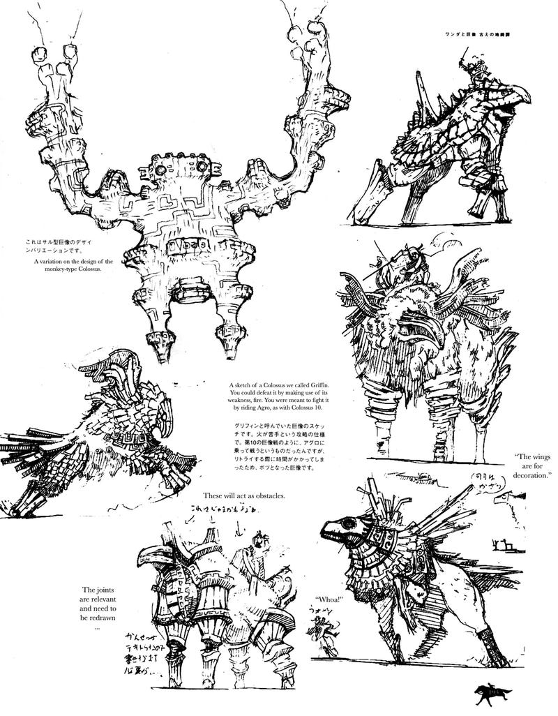
To the left is an example of concept art from the game, Shadow of the Colossus, where there are a total of 16 main enemies, which are all bosses. Each brings it's own unique design and attributes. As you can see, the sketch eventually transferred into the real game, and became a walking titan.
Image result for shadow of the colossus concept art
Scrapped Colossi Concepts

The second piece of concept art is from the same game, but all these ideas were scrapped in favour of the current content we got. Each piece though shares the same amount of care and diversity that every design got, which can make the field of concept to be quite disheartening at times, to see a project you spent so many hours on not make it into the final game. It's also a factor that can spur some backlash from the fanbase, as there are many cases of cut content/scrapped ideas causing fans to question the thought process and claim the game would've been much better if it was included. Typically, an artist will start with a rough sketch, then either roughly colour the sketch to check that they work well, and begin to add a more tuned line work and paint job/shading to improve that final version. However, you can just finish with the initial sketch.


Progression towards the design piece is a fascinating process, as the design can drastically alter from the original "beta" sketch. Here we can see just how far the character Ragna the Bloodedge (BlazBlue), went from skin-tight clothing, brown hair, and a medium sized sword, to having exaggerated, yet distinctive white hair, buster sword and a red coat. This leaves a more lasting impression of the character, and colour theory must also be taken into account, as you'll want to make colour combinations compliment one another. You don't want a character with colours that don't go together and appear "ugly" and unattractive just based off their clothing. Red is typically considered to be a protagonist colour, especially within the fighting game realm, so someone familiar with the series will most likely see this character as that without even knowing who they are, and the more exotic design displays a sense of relevance as well, I mean, who would need a sword that big? The main character, that's who.


Image result for blazblue concept art
Ragna the Bloodedge Concept Art progression
Here is Haku-men from the same game as previously shown, BlazBlue. We get a really great close up of his armour, and how it moves with him, as the size and unique style may cause some curiosity. The upper torso is broken down into sections that demonstrate how his swords sheathe is attached to his back, how the neck piece breaks into sections as he looks upwards, shoulder leveling, and wast twisting. It's also common to find a front and profile shot, to get a better look at the proportions of the head/body type. The style of his armour brings a familiar flare to that of a samurai, due to the pony tail and Japanese Hakama styled legwear, but with the games own unique flavours sprinkled in to make the character fit into the universe. Breaking down the characters this ways allows you to appreciate more aspects of the design you may not have noticed before, such as the red eyes planted around his armour, or just how the pieces flex and bump against one another.
Image result for blazblue concept art
Haku-men Concept Art (BlazBlue)
Another style is that of illustrations, as well as key-frames. This is commonly used as a way to sketch out important shots from a scene or to further demonstrate a characters abilities, and to give a "skeleton" to it, so for example, you would have a character attacking as a key frame, and then the standby phase of the conflict, then draw in what goes in between to make that scene be complete. Although often times, illustrations are primarily used as "stills" to show the story with powerful art and allowing the sound design to immerse the player within the scene. Think of it like a graphic novel, but with an audiobook backing it.
Image result for blazblue concept art
Captain Hazama Concept Art (BlazBlue)

Key-framing works very similarly, but is more focused on breaking down animation steps, like the mouth movement, body alterations and so on. Each step is a key in the timeline, and once more frames are filled in to join all the key-frames together, you end up with a fluent animation to come to fruition. This can apply to 3D model animations, and 2D drawn animations.


Below is a piece of environment concept art is from Dark Souls: Prepare to Die Edition, as shown in a gorgeous panoramic shot. It evokes the feeling of an isolated ruin, long past its time, slowly but already engulfed in plantation, but the openness of the arena brings a gladiator feel to it, where two must battle to the death in a heart-stopping intense duel. The boss itself is on display, but cast in dark, incomprehensible shadow, hunched over as if it's being drained from the weight of darkness, as a ray of light casts down upon him. Which could lead to interpretation that the Knight must seek enlightenment or just light itself to free himself from the dark that shackles him, whilst barely being able to lift his sword. This is all given for the viewer to dissect and interpret their own meaning behind the artwork, and take a look at what the artist wanted to show through their vision of this level/world. As well as this, the style, mood, character, and symbolism all coincide with the theme of Dark Souls, not feeling out of place or easily mistakable for another game. This game is dark, brooding, lifeless, but also, displays a shimmer of hope, as seen from the light being cast down on this ruined battleground.


Image result for dark souls prepare to die edition concept
Dark Souls Prepare to Die 


Concept art can come in many forms, and is widely sought out by fans that want to examine and take apart each design to full appreciate the effort that goes into the design aspect of games. Artbooks are extremely popular with granting this desire, and are sold are high prices or often included with special edition purchases of the game. It can act as a way to inspire and drive artists to seek out a career within the games industry so that they too can add their own creative mind to a project to bring something imaginative to the game.
Related image


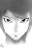
I've also drawn up my own concepts for my game, that are still in early development. The way I do this is with a program known as PaintTool SAI, with a Wacom Grahpics tablet. I sketch out a rough concept, then gradually go inter further depth with the shading and lineawork. So far I've drawn a brief beta design for the Main Character and some variations of clown enemies.

Tuesday 11 October 2016

Understand theory and applications of 3D


Tom Estill
Understand theory and applications of 3D

  • Various Uses

The use of 3-D has grown more prominent and is practically implemented among almost all of the media today, from Films, TV, Cartoons and games. A good example of the use is in Hollywood films, by the creation of special effects and CGI (Computer Generated Imagery), environments can be crafted that are not physically in the real world that the actors can interact with these interact with these generated effects. 

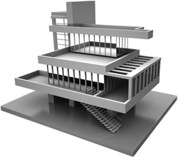
Image result for architecture 3d modelsArchitecture is often developed and made with 3D models so the designers can see exactly how it'll look and how it can be adjusted before the final project is constructed, as well as cars that are constructed for testing and presenting before further development. It is a key factor in making efficient products in the long run and being able alter and change the design within the 3-D realm instantly with the fully rendered model. Scientist and Geologists can even create 3-D models to simulate various elements, like the human body, natural occurrences and other various models to manipulate and learn from. 

Action figures as well can be constructed within a 3-D modelling software, which will then be used as a mold. 3-D printing works very similar to this, as a way to create a 3-D model in the real world to fiddle with.

  • Polygonal Improvement 


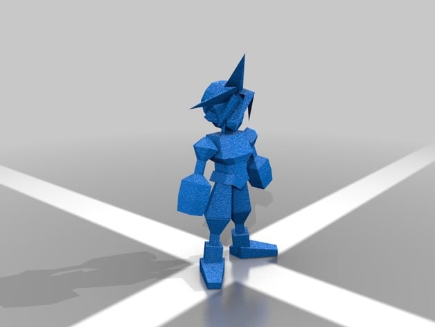
Image result for final fantasy 7 cloud modelVideo games are constantly evolving, coming from 2-D pixelated sprites, to full 3-D polygonal models, from the sharp, low poly models from the 64 bit era such as Super Mario 64, to his new high definition model featured in his more recent titles. This is a show of progression with what can be rendered in 3-D, disregarding the fact that Mario is in fact a model that doesn't demand much, due to the cartoonish look. 
Compare that to most photo-realistic games that come out today. 

This can be shown in great comparison with an more older game like Final Fantasy 7, over the years there have been more additions to the this particular games (CG movies, Remake), and each have shown a mass increase in production and technological enhancements, such as a higher defined models, showing a drastic detail and polygon increase, further demonstrating the improved technology.


Films and animated features often tend to implement computer generated imagery, take for instance the first full feature length 3-D movie, Toy Story. Released in 1995, became a classic among the film industry for revolutionising the art of Animated films, and while the software is very outdated, the results were still a landmark for its time. Handling lower polygonal models than what we have now, the film definitely holds up, yet the new additions to the series have shown much improvement to polygons, lighting, fluent animation and textures.

Below is a good example of how a scene of animation looks without rendered lighting (left side), and comparing it to the final product with all the assets enabled. (right side)

Image result for Toy story concept models
  • Mesh and Animation


Image result for Model rigging
Image result for 3d modelling
Image result for geometric theory 3d modellingOften, when creating a mesh of a 3-D model, you'll draw up a sketch concept art of the model, and then import it into the software that renders your models. Programs like Maya allow this with importing an image into the image plane. Allowing you to generally create a mold which you can then adjust the smoothness of the faces and alter how you choose. Among this, many professional business like Disney will create molds of the characters which the creative staff can hold and even manipulate to alter the appearance if need be. To us as more of a reference. The geometrical theory of 3-D modelling is with determining the how your base shapes and mesh is constructed, using vertice, the point of the shapes corners. Edge, the line marking the perimeter of the shape, and the face, the surface of the shape. For bodies, the polygonal faces are often set in quads, while more detailed faces are triangular with more emphasis on polygons and smoother edges. 

Image result for 3d model moldsAnimating your models typical has you rigging bone-joints to your model, which will then allow you to perform movements with their limbs similar to that of an action figure. When it comes to actual animation, you'll need to start using frames of animation, and using Key frames to pin point specific poses and acts of the animation. For example, setting a key frame after each step of a walking animation.
(Examples of modelling shown below)

  • Constraits
While modelling is very handy for creating and rendering models and environments, the resources for the software can be pricey, as well as that, requiring a fairly high end computer to handle all of the polygons if the model you're creating gets a bit too demanding, and as well as this, having enough space and RAM to contain all of the files you'll be holding. The process of also making the models can sometimes be wasteful and a strain on time if you keep having to make them and adjust the mold.